Data Visualization | Data and the Web

Data and the Web

Archive for the ‘data visualization' Category

Fun (and Fraud Detection) with Benford's Law

Tuesday, July 22nd, 2008

Benford Law Graph - smallBenford's law is one of those things your high school math teacher would break out on a slow, rainy day when the students' attention span was even lower than usual.

He'd start out by asking the class to look at the leading digits in a list of numbers and then predict how many times each leading digit would appear first in the list. The students would make some guesses and eventually come to the consensus that the probability would be pretty close — about 11% each.

Then, the teacher would just sit back, smile, and gently shake his head at his simple-minded pupils. He would then go on to explain Benford's law, which would blow everyone's mind — at least through lunchtime.

Play Benford's Law Video

(Click the image above… or here's an embeddable YouTube version)

Per Wikipedia:

Benford's law, also called the first-digit law, states that in lists of numbers from many real-life sources of data, the leading digit is distributed in a specific, non-uniform way.

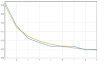
Specifically, in this way:

Leading Digit     Probability
      1              30.1%
      2              17.6%
      3              12.5%
      4               9.7%
      5               7.9%
      6               6.7%
      7               5.8%
      8               5.1%
      9               4.6%

Again, from Wikipedia:

This counter-intuitive result applies to a wide variety of figures, including electricity bills, street addresses, stock prices, population numbers, death rates, lengths of rivers, physical and mathematical constants, and processes described by power laws (which are very common in nature).

Boiling it down, this means that for almost any naturally-occurring data set, the number 1 will appear first about 30% of the time. And, by naturally occuring, this can mean check amounts or stock prices or website statistics. Non-naturally occurring data would be pre-assigned numbers like postal codes or UPC numbers.

Besides being fun to play with, Benford's is used in the accounting profession to detect fraud. Because data like tax returns and check registers follow Benford's, auditors can use it as a high-level check of a data set. If there are anomalies, it may be worth investigating closer as potential fraud.

If you're interested in further information about fraud detection using Benford's, definitely give these two articles by Malcolm W. Browne and Mark J. Nigrini a read.

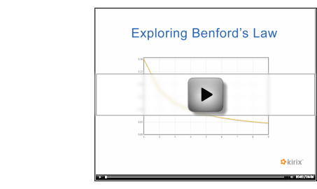
Try It Out for Yourself

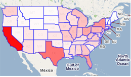
Take a look at the demonstration video above to see Benford's law in action with data sets from the web. If you'd like to play with it yourself, just install the Benford's Law extension for Kirix Strata™ and have fun.

Also, please note that I used the following data sets in the video, if you'd like to give those a spin:

Wikipedia List of Lakes in Minnesota
US Census Data Sets
Social Blade - Digg Statistics

And here are a few other worthy ones that didn't make it in the video:

NASDAQ Historical Stock Price
Wikipedia List of Countries by Population
And plenty more at Delicious here…

Enjoy!

Pill Bugs, Potato Bugs or Doodlebugs?

Wednesday, November 14th, 2007

Image - Pill BugIf you haven't checked out what the fine folks at Many Eyes are doing with “community” data visualization, it is well worth a peek. I took a look at one of their recent blog posts today regarding the new map visualizations they are offering. Very nice stuff indeed.

However, the thing that really caught my [many] eye[s] was the mention of a data set denoting “the regional slang for those odd little bugs that curl into balls.” This is definitely not something that keeps me up at night, but I've always wondered about the monikers of these benign little creatures. I grew up calling them “pill bugs.” However, probably due to some deep psychological desire to be accepted in elementary school, I eventually started referring to them as roly-polies, since that is what my friends called them.

I dug up the visualization in question and was pleased to see that I probably wasn't the only kid in Chicagoland that may have struggled with these entomological naming conventions — in fact, there are a bunch of other names given to these li'l guys across the US. For posterity, Illinoisans call this thing a Pill Bug, Roly-Poly, Potato Bug, Sow Bug and Doodlebug 15%, 41% 7%, 6%, and 3% percent of the time, respectively.

The one downside that I've encountered with Many Eyes is they only seem to provide the underlying data set in a .txt file (albeit in tab delimited format). Kirix Strata™ doesn't yet recognize the tsv-in-txt's-clothing just yet, so you need to save the file to the desktop and then open it up in Strata (selecting a text-delimited file type with a tab delimiter). But, once you get it in there, fire up your analytical skills and manipulate away.

Also, please report any bugs while you're at it. ;)

Edit: Per Wikipedia, there are a bunch of other common names associated with these insects, including my favorite, “cheeselog.”

Finding Data Tables on the Web

Saturday, November 3rd, 2007

GraphWise LogoI'm slightly (fashionably?) late to this party, but I just came across a new website called GraphWise that sets out to be the search engine for tabular data. In a recent press release, they state, “…if you want to search for videos, you go to YouTube, and if you want music, you go to iTunes. If you're looking for tables of data we aim for users to go to GraphWise.” The comparison may not be entirely accurate since YouTube and iTunes search only their own catalogs, but the vision has some potential if they can pull it off.

Currently, when I look for a data set on the web, I start with these standard tactics:

  1. Google Search, by keyword only
  2. Google Search, by keyword with file type qualifier (e.g., filetype:csv)
  3. Delicious Search, by keyword
  4. Delicious Search, by tag (e.g., publicdata)
  5. Data “Repository” Search, such as Swivel, Data360 or ManyEyes

GraphWise provides an additional option to find data. It apparently spiders data (from HTML tables, CSV files, licensed sources and user uploads), then imports and normalizes the data and, ultimately, develops graphs based on the data (similar to Swivel or Data360). I rarely have need for auto-generated visualizations, but I really like the fact that they provide the URL to the original source table. With Kirix Strata™, it's obviously a piece of cake to just import the raw table and start using it.

I did have some trouble finding useful data sets based on my search queries (forgivable, as the service is still in beta). For instance, in my previous blog post, we needed to find area code data in tabular format. So, I searched for US Area Codes in GraphWise, but got nothing even close to what I was looking for. For a simpler example, I search for Apple's stock price. It looks like GraphWise licenses historic stock information from a company called CSI, but only displayed the data in bite-sized chunks. I know I can easily download the full set of Apple's historical stock data via CSV at Yahoo Finance, but that wasn't listed as a resource.

It appears GraphWise has done well with the spidering technology to identify and capture table information across the web. The next big step will be to make the search queries more relevant. Because HTML and CSV files aren't often linked to directly, it would be really difficult to apply the kind of PageRank algorithm that makes Google so valuable. I can imagine some other issues as well, like trying to separate a table name (if available) and the actual text within a given table. Hopefully they'll be able to overcome these hurdles; it would be great to have a Google-like place to identify tabular data on the web.

(via Swivel)

Mr. MacGyver, Meet Kirix Strata

Tuesday, October 16th, 2007

Map Visualization 2(NOTE: Screencast of this exercise is available below.)

A few days ago, the always datariffic folks at Juice Analytics posted an article about MacGyver-ing call volume data and pushing it into an online mapping application called Mapeteria. Basically, they were doing some ad hoc data visualization comprised of public web data, private phone call data and a web service that provided the visualization (which in turn used the Google Maps API).

Huh… local data, web data and web APIs? Sounds like a perfect application for a data browser (well, it would've been perfect if the web service accepted a POST command, but I digress). A data browser enables you to easily access web data, combine it with local data, perform any required data clean up and then push/pull data from the web — without ever leaving the tool.

It also would've saved Juice a bit of time, particularly with grabbing area codes and prepping that file. Let's look at the four steps they went through and we'll see how Kirix Strata™ might improve the experience:

1. Pull out the area codes.

The data had phone number values like “12345678901″ as well as “2345678901″, so they used the following formula to pull out the area codes using Excel:

=VALUE(IF(LEFT(E7,1)="1",MID(E7,2,3),MID(E7,1,3)))

Strata would use a similar formula:

iif(left(tel,1)="1",substr(tel,2,3),substr(tel,1,3))

The main time savings here (particularly with large files) is that the calculated field populates automatically for every record in Strata, instead of needing to paste formulas. OK… not terribly exciting thus far.

2. Convert area codes into states

This is a multi-part step:

a) Locate a table from the web that has area code data associated with a state ID (while fending off parasitic scammers).
b) Clean up the table as necessary.
c) Do a lookup from the phone call data that adds in the state where the call originated from.

Strata can really cut down the amount of time spent on this step. Because of the website used, the folks at Juice surely had to create his lookup table manually. I went to Delicious, searched for “area codes” and found this very useful website, which had all the data in a nice HTML table. With Strata, I simply right-clicked and selected “Import Data” and immediately had the table I needed for the lookup.

Finally, I created a relationship between my two tables and dragged in the state codes (e.g., CA, IL, NY, etc.) into the phone call data.

3. Create a summary data set

This was done using a pivot table in Excel. Strata doesn't have classic pivot tables in its feature set at this point, but it does have a nice li'l grouping utility. So, once I knew what csv format was required for the Mapeteria web service, I grouped the data accordingly.

4. Create colorized map the of U.S.

This is the “almost perfect” part I referred to above.

Though Mapeteria is a very cool visualization service using Google Maps, it needs to fetch a CSV file embedded in a URL from elsewhere on the web. If the service was able to accept data via a POST command (or something like an “Upload Data” button), Strata would have been able to just take the table we created and push it to the web service, no csv transformation required (in fact, we've got some stuff cooking in our labs that would make this as easy as copy and paste). And, if we were just able to push the data out like this, we would have immediately gotten the map without ever leaving our data browser.

But, like Zach at Juice, I had to save the file in a CSV format and then upload it to a server before I was able to get my map. Here's a screencast of the entire process… once I found the area code data on the web, it took less than 5 minutes to get my map.

Play Video

(And here's an embeddable YouTube version…)

If anyone wants to try this process out for themselves, please feel free to download Strata and give it a try. This data browser is in beta and completely free to use; we're also giving away free full licenses to anyone who provides feedback during the beta period. Oh, and here is the sample phone call volume data I used for this exercise:

Click here to download Phone Call Volume Sample Data (.csv, 10KB)

This is a pretty simple example of how Strata can be used for ad hoc data access and manipulation with data from the web (or, as one can imagine, within a corporate intranet) and make this kind of analysis very efficient. Throw in some web services, web APIs or very large files into the mix, and you've got the chance to do some fairly interesting things.

As always, if anyone has any questions, either post in the comments below on in our support forums… or just shoot us a support email. Thanks!

About

Data and the Web is a blog by Kirix about accessing and working with data, wherever it is located. We have a particular fondness for data usability, ad hoc analysis, mashups, web APIs and, of course, playing around with our data browser.